Episode 19: Escape from #ElectionTwitter
A conversation with Split Ticket's Lakshya Jain
Election forecasting is complicated, and every forecaster approaches the task differently. I talked to Lakshya Jain, co-founder of Split Ticket about their approach to election analysis, aggregators, models and more. You can listen to the episode here (don’t forget to hit subscribe, give us a rating, etc.):
Before we get into what Jain had to say about how he and his colleagues at Split Ticket approach it, we have to start with something pretty basic that a lot of the readers of this newsletter understand, but a lot of other folks definitely don’t. Let’s bring this to life with a little example of it:
If you work in polling you might forget this but let me make it very clear:
The median voter isn’t really looking at polls or forecasts, but they hear other people, like Rogan here, talk about them.
They don’t know the difference between snap polls conducted by Elon Musk on Twitter and any other kind of poll. Odds are, they’ve never responded to a real poll.
They also don’t know the difference between a forecast and a polling average. Rogan is not exceptionally stupid here, he’s exceptionally average.
#ElectionTwitter is decidedly not populated with average people.
Election Twitter is made up of people who, often just for fun, are willing to scrape the cross tabs, compile their own polling averages, develop their own formulas to weight polls and demographics, and create their own visualizations for how to assess the state of an election. To be sure, some are also operating almost entirely on vibes. Many believe that somewhere between what is relatively easily quantified and what is almost impossible to quantify lies the truth.
And that leads them to build their own sophisticated models that try to account for many factors, from candidate strengths to voter demographics to economic measures to historical trends. While these models strive for accuracy, they must contend with the inherent unpredictability of human behavior and the challenge of trying to represent the ineffable with numbers.
I remain skeptical about what I’ll call the street value of these exercises. As I said, most people never took a statistics course. Most people take the reporting of polls at what appears to them to be face value — I have a post coming up about the pitfalls of journalistic and pollster conventions in the way they portray polls and forecasts. And most people aren’t going to dig into these numbers, try to understand types of error, download the github data, or decipher the published model equations.
But my guest this week, Lakshya Jain of Split Ticket, does a great job of explaining his approach, and his path, including what drew him to analyzing polls and developing aggregators, maps and models; how he thinks about the value of cross tabs; what he’s observed in this volatile election year; and why it’s so essential that we all embrace uncertainty.
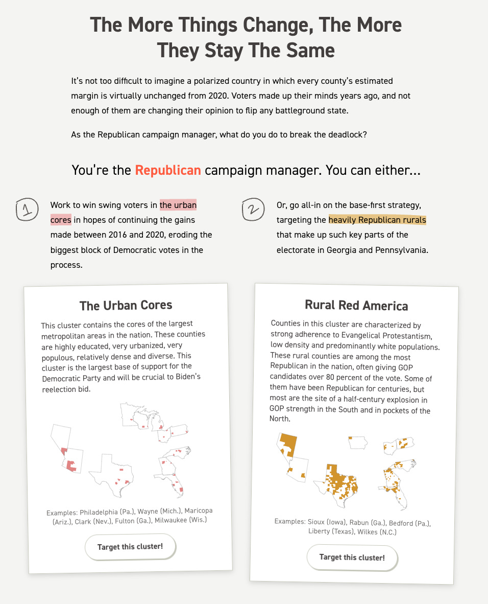
There are a couple of projects they produced that I think are especially worth calling out for those amateur campaign managers out there. The first is a collaboration Split Ticket did with Politico called “You Be the Campaign Manager” — it’s fun, and it might challenge some of your assumptions about how hard it is to move the needle in different parts of the country.

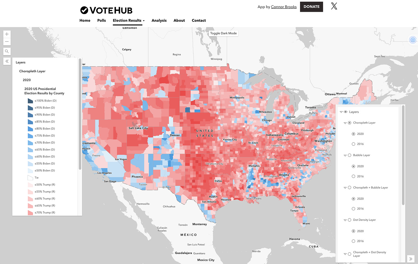
The other comes from another outlet that arose from Election Twitter, VoteHub. They use GIS data to map the electorate, and have been compiling this data for primaries as well as general elections. You can really dig into the data and see how different areas voted, and you can find it here.

Here’s a summary of what Lakshya and I discussed.
The art and science of election modeling
Election models are not just about crunching numbers from polls. They incorporate a wide range of factors to predict outcomes more accurately. These can include economic indicators, candidate characteristics, and historical voting patterns. However, even the most sophisticated models have limitations. They struggle to account for last-minute shifts in voter sentiment or unexpected events that can swing an election. This is why embracing uncertainty is crucial in election forecasting.
The importance of cross tabs in understanding voter behavior
Cross tabs, or detailed breakdowns of poll results by demographic groups, offer insight that goes beyond top-line numbers. They reveal which groups are driving a candidate's support or where they might be losing ground. For example, recent polls show Kamala Harris making gains among young Black and Latino voters compared to Joe Biden, potentially reshaping the electoral map. This granular data is useful for campaigns to tailor their messaging and for analysts to understand the underlying dynamics of an election.
Embracing uncertainty in forecasts
One of the most challenging aspects of election forecasting is communicating probability to the public. A 60% chance of winning doesn't mean a landslide victory – it's only slightly better than a coin flip. Forecasters are exploring new ways to express these probabilities, such as using real-world analogies or grouping probabilities into broader categories like "toss-up" or "likely win." The key is to help the public understand that forecasts are educated guesses, not crystal ball predictions.
The shift from Biden to Harris
The recent change in the Democratic presidential nominee from Joe Biden to Kamala Harris provides a fascinating case study in how a single factor can reshape polling data. Initial polls show Harris performing better with certain demographic groups, particularly younger voters and voters of color. This shift illustrates how candidate characteristics can significantly impact voter preferences and potentially alter the electoral landscape. It also highlights the importance of continually updating models to reflect changing circumstances.
If you’re on Spotify, you can get the episode here:
Resources
- An elections agency that provides data-centric analysis, modeling, and forecasting for political elections, focusing on thorough and unbiased coverage.
We Dug Into the 2024 Polling Crosstabs. What We Found Was Stunning. (Politico)
- An article by Lakshya Jain and a colleague analyzing 2024 polling cross tabs before and after Biden's dropout and Harris's entry into the race.
How The Times/Siena Poll Is Conducted (The New York Times)
- The New York Times' polling methodology, which doesn't weight for recalled vote due to reliability concerns and uses L2 modeled party ID.
Pollster Ratings (FiveThirtyEight)
- FiveThirtyEight's carefully curated and transparent pollster ratings, which Split Ticket uses to assess poll quality in their aggregations.
Silver Bulletin 2024 presidential election forecast (Nate Silver's Substack)
- Nate Silver's election forecasting model, which, like Split Ticket, combines fundamentals and polling data for predictions.
270toWin - 2024 Presidential Election Interactive Map
- An interactive electoral map website that predated FiveThirtyEight as a popular tool for amateur election prognosticators.
L2 Voter Data: Frequently Asked Questions (FAQ) (UC Berkeley Library)
- A voter file resource used for modeled party ID and voter data, though it may overestimate Democratic leanings in some states.
- A polling app excluded from Split Ticket's aggregation due to concerns about its sampling methodology relying solely on app users.
Our Guest
Lakshya Jain is a machine learning engineer who analyzes political data in his free time. He handles modeling, data pieces, and presidential ratings for Split Ticket. Jain graduated from UC Berkeley with a BA in 2019 and an MS in 2020, majoring in computer science. He currently works in the tech industry. His political analysis and writing have appeared in prominent publications such as The New York Times, Sabato's Crystal Ball, and The Bulwark.