Great advice for readers from Lakshya Jain from SplitTicket, whom I interviewed Friday for a forthcoming episode of Cross Tabs:
“Embrace uncertainty.”
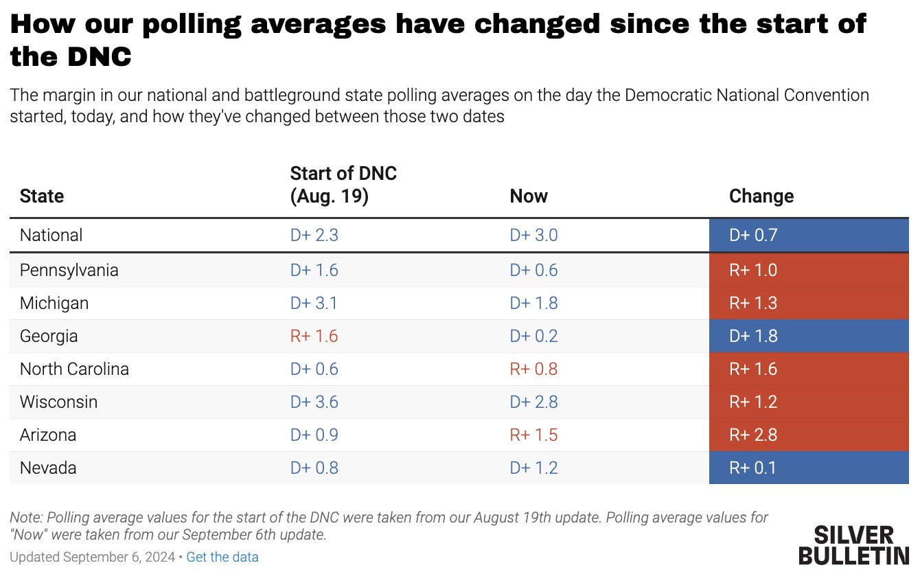
I think that’s right, but it’s funny coming from folks who aren’t, in fact, embracing uncertainty1 — they’re harnessing it, and attempting to tame it, down to the 10th of a percent, in some notorious cases.
New episode coming out with
tomorrow — so in his honor, I’ll quote from a recent substack: “the hard rule in scientific journals is that the number of decimal places should correspond to the precision of the measuring instrument…” There’s no way that the measuring instrument — a codified set of mostly educated guesses is precise enough to estimate down to the tenth of a percent. But, as Mike says, “readers cannot help but take numbers with decimal points more seriously.”Subscribe to the show on Apple Podcasts:
If pollsters, forecasters, and aggregators wanted readers to embrace uncertainty, they’d express it more clearly, and more honestly. The WSJ recently wrote a very adorable piece explaining the margin of error with kittens — and while many pollsters had started to incorporate visualizations of their margins of error into the polling reports, that seems to have fallen out of vogue again. I suppose those variances clutter up the chart, and besides — despite admonishing readers to remember that polls are only snapshots in time, that averages are only averages, and that forecasts are only forecasts (not predictions), deep down they know that readers come to these sources for an answer. And answers are certain, even if they’re only temporarily certain.
The problem with this nonchalant attitude towards expressing uncertainty — placing the onus instead on the reader to embrace it — is that when people who are not pollsters or forecasters or cross tab spelunkers want to know if they can “trust” the polls, in some small part this is because the polls are a signal to them about how optimistic or pessimistic they should be, and that influences behavior.
If you believe the race is close but winnable in your state, you might be more likely to vote. If you believe the winner is a foregone conclusion, you might be less likely to vote. If the stakes are high and the polling is tight, you might be more likely to volunteer or talk to your family, friends and neighbors; if the stakes are low and one candidate looks like they’re going to walk away with it, then you can safely ignore it all. There is some reason to believe that polls suggesting the Labor party was going to win in a landslide in the recent UK elections may be why the turnout was not as high as anticipated. There’s also some evidence to suggest that the turnout in 2016 was not as high because it seemed impossible Trump could win.
If you know for sure one party is going to win, you can vote strategically, or not at all. If it’s a toss-up, and you live in a battleground state, you might feel energized or depressed, or empowered to vote strategically or lodge a protest vote, depending on what the polls look like.
When I asked Lakshya if people should rely on the polls or the aggregates or the forecasts to decide how or whether to vote, he laughed and said no. But if that’s a risk — that readers will base at least part of their decision to vote, then there’s a responsibility on the part of people publishing these results, aggregates and forecasts to clearly communicate uncertainty. And it doesn’t seem like they want to do that. Maybe it’s better for the business model.
Likely Voters?
I was looking at the most recent NYT-Siena cross tabs and … I guess I’m confused. When you look at the Registered Voter cross tabs, and then at the Likely Voter cross tabs, they have the same base size. And that doesn’t make sense.
But then I noticed a subtle change in the nomenclature (it may have been there before and I didn’t notice it). In the cross tab table they don’t call it “Likely Voters”, they call it “Likely Electorate”. And that sort of suggested to me that the way they get to the Likely Electorate numbers is purely through weights, not through a hard screen.
Let’s start with why I think this isn’t a terrible approach: for one thing, there’s a lot of uncertainty about who a likely voter is going to be. People are going to vote this fall who have never voted before; others will not have voted in the past general election; some may not have voted for years. It’s impossible to predict which new or infrequent voters are going to vote with a high level of certainty, so you might as well allow a few 2020 non-voters, for example, or a few “somewhat certain to vote” respondents into the mix.
But here’s why I think this reveals why the likely voter screen is so unhelpful. First of all you have to know how the screen works.
Typically a pollster identifies a likely voter in a few ways:
Registration status. Some pollsters use the voter file to validate registered voters, like NYT/Siena. But some don’t. They ask the voter if they are registered, and some percentage of voters are wrong about their registration status. There are good reasons for this: people move, voter rolls get purged, and so on. I check voters in at our polling place during elections and a few people come in trying to vote who don’t show up on our rolls. Some realize it’s because they didn’t reply to a postcard because they winter in Florida; others realize they’re registered to vote but went to the wrong precinct; others registered to vote after the deadline. It happens.
Past voting behavior. If you have a partner like L2, you can verify that someone voted in the past 2-4 elections. If you don’t, you ask the voter. Something like one in ten voters will be wrong about their past behavior. They think of themselves as voters, so they must have voted, except they didn’t.
Past candidate selection. There is no way to independently verify who a voter voted for, because the ballot is secret. We know the counts but not who voted for whom. Again, there is something like a one in ten chance people misremember who they voted for last time.
Intent to vote. Voters say they are very likely or almost certain they will vote. But we won’t know until long after election day whether they did. If your total of very likely + almost certain is over 85-92%, you’ve got some amount of error in people’s projections. You also have no idea whether the actual final turnout will be made of the people who answered in the top two boxes.
So what we know for sure is that we don’t know for sure who the likely voter is going to be. The best predictor is registration since turnout among registered voters is about 20 points higher than turnout among the voting eligible population.
If it were up to me, a polling average or aggregator would not use likely voters. It would stick to registered voters only instead of getting fancy with weights or screens they can’t be sure are accurate.
I’ll embrace uncertainty when you express uncertainty
It seems to be asking too much of pollsters, forecasters and journalists to do a better job of visualizing or explaining the uncertainty in their work. The margin of error bands, after all, can’t be only the sample error; they need to reflect the error rates on different question types, and base sizes, and reflect the known inaccuracy rates in self-reported behavior. But that, one supposes, gets messy and leaves people in some kind of murky, impressionistic view of what’s happening. (I think this is the accurate view since none of these folks claim to have prophetic powers.)
But if we’re sacrificing both accuracy and clarity in the way we portray the results of a poll, is it even possible for a reader to understand the poll?
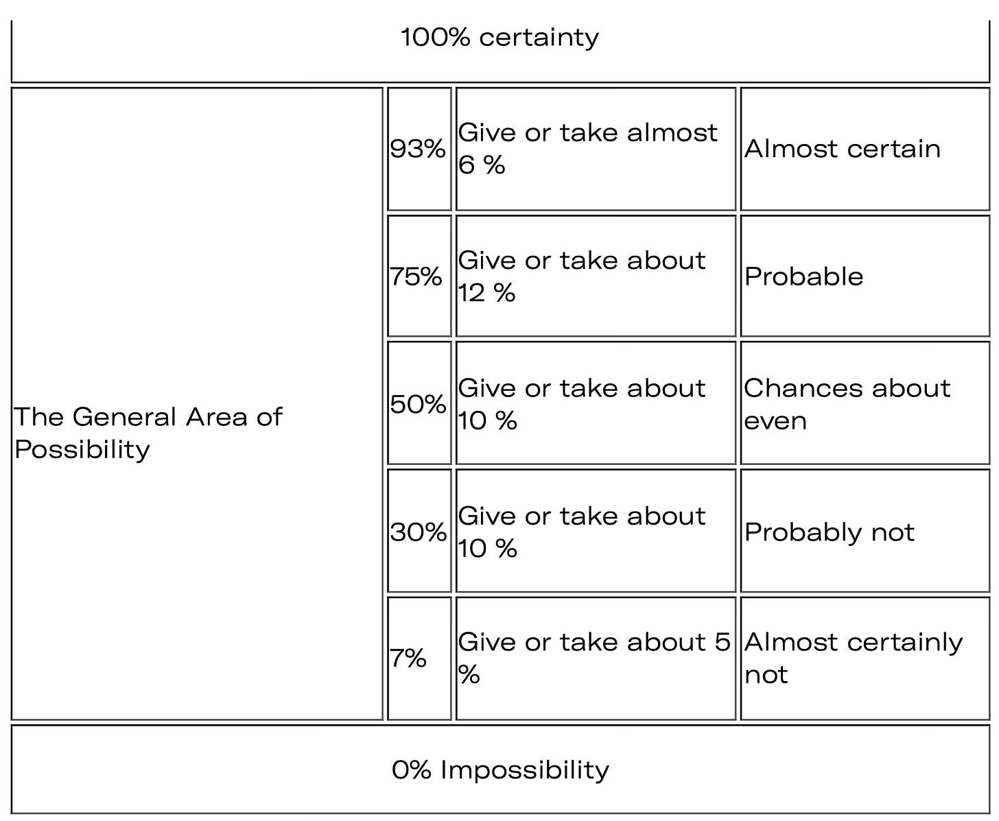
There is another way of expressing certainty and that’s with plain, consistent language. This is, perhaps, most applicable to how the forecasts are described, though each question or poll could offer its own certainty rating without relying on statistics terminology most people will not be that familiar with. The CIA offers some guidance here:
So rather than saying, for example, that Candidate A has a 60% chance of winning the election, why not remove the numbers (or put them in footnotes) and let the headline characterization of the odds be, “about even”? By not attempting to be so — frankly artificially — precise, we might get to more accuracy, and return a sense of agency to everyday voters.
Solutions Section (every rant needs one)
I’ve been thinking about how I would express a poll average or a forecast if I were to build such a thing.
I wouldn’t try to overdetermine the makeup of likely voters. I’d live with the uncertainty about registered voters, and express a combined margin of error reflecting sample error plus what I’ll call “turnout error.”
I would try to express uncertainty in every chart depicting total response, or any cross tab. If, as Nate Cohn writes and most pollsters agree, a binary question has an error rate roughly double that of the sample error, I’d say so, instead of defaulting only to an expression of the sample error.
I’d use the CIA method for expressing uncertainty in forecasts. Here’s what a round-up of forecasts today would look like:
Silver Bulletin: Trump’s chance of winning is on the border between probable and about even.
538: The candidates’ chances of winning are about even.
The Economist: The candidates’ chances of winning are about even.
The Hill: The candidates’ chances of winning are about even.
And if you’re thinking, “But Farrah, if you articulated the odds like this, nobody would care that much”, then congratulations. You understand me perfectly.
Subscribe to the show on Spotify — latest episode here:
To be clear, SplitTicket doesn’t forecast, though they do offer “temperature checks” on the election via polling in battleground states since those will determine the outcome in November, through the Electoral College. Never forget: the popular vote is a bit of a sham.


